|
In 2015, a man was falsely accused of being a pedophile after taking a selfie with a Darth Vader display at a shopping center in Melbourne, Australia. The man saw a Star Wars display and decided to take a picture with it to send to his kids, who are big fans of the movies. There were a couple children standing around the display, so he politely told them he would just be a second and that he was taking a picture to send to his kids. The children’s mother was standing nearby and saw what happened. She misunderstood the situation and thought that he was taking a picture of her children. She took a picture of the man and posted about the situation on Facebook, calling him a “creep” (a screenshot of her post has been attached). The man didn’t see the mother and had no idea that she took a picture of him. He found out during a meeting at work when his phone kept going off. The post was gaining attention on Facebook and people were calling him a pedophile, sex offender, and creep. He immediately went to the police station to explain what had happened. He was cleared of any investigation, but the damage had been done online. Afterwards, some people went on to attack the mother for her mistake. She even received death threats. This situation happened because there was a miscommunication. The mother saw what was happening but was not close enough to hear everything the man said. Therefore, it was taken out of context. Instead of addressing it in person, the mother decided to publicly shame the man online. Social media is unique because it can reach any type of audience. In this case, a mother was the author who shared a post about someone threatening her children. Other mothers saw this post wanted to share it in order to raise awareness and protect their children. Through people sharing the post, it reached an even wider audience. The audience took what the mother said to be true, even though they were not there to see it for themselves. One of the biggest problems that comes along with the internet is that people often assume what they are reading is true instead of taking the time to check out the source. While there is no way to undo the damage that has been done, this situation could have easily been avoided. If the mother had either confronted the man in the store or turned him into the police, without spreading his picture all over the internet, none of this would have happened. We live in a “cancel culture” that believes in publicly shaming people on the internet instead of confronting them one on one. This is dangerous because someone’s reputation can be ruined because of a misunderstanding. This can take a toll on their mental health, family, job, and lifestyle. This situation is similar one mentioned in So You’ve Been Publicly Shamed where Adria Richards tweeted a picture of two guys that made an inappropriate joke during a conference. In this situation both Adria and the man she shamed online lost their jobs and were humiliated on the internet. In the Star Wars selfie case, both parties involved also suffered from this public shaming. While no one lost their job, they were both humiliated and received hate online. Sometimes when a public shaming takes place, the person who did the shaming can receive backlash and shame as well. This goes to show that in most cases one should try to deal with situation in person before bringing it to the public online. Sources: https://www.heraldsun.com.au/leader/outer-east/men-feeling-under-siege-after-revelation-man-was-wrongly-accused-on-facebook-of-being-a-creep/news-story/1c97a18d00d0977191b5493ba69c221c https://mashable.com/2015/05/11/darth-vader-selfie/  
1 Comment
For the site design and logo, I wanted to focus on the contrast between black and color to highlight the whimsical feel of the play. The background color of the site is black to represent the isolation that the island brought to Prospero. Purple is used as an accent color to represent the magic that brought his family to the island where he was able to forgive them. I designed the logo by altering a basic font in Adobe Illustrator to make each letter look like a lightning bolt. My idea for the logo came from the storm at the beginning of the play that causes the ship to wreck on the island. That event serves as the catalyst for everything else that happens, so I wanted to include it in the site. The color purple is used for the logo to showcase the whimsical aspect of the play. On the home page, I used a black and white picture of Prospero with his staff pointed in the air to create the illusion that he was casting the lightning in the logo. The black and white picture makes the purple text stand out. Over to the side I listed each page that will appear on the site in the order that we discussed in class. The “Cast” page layout continues with the repetition of black with a purple accent. The Tempest logo is aligned on the center of the page with a menu bar underneath. The current page, in this case “cast,” is highlighted in a lighter color so viewers know which page they are on. For the cast page specifically, I thought it would be a good idea to put the entire cast photo at the top, followed by a summery paragraph about the cast. Everything on the page is aligned in the center. At the bottom of the page there are three pictures of cast members, one for each actor that we have interviews for. Viewers will be able to click on the picture of the actor and be taken to another page where the video and more information about the actor will be. 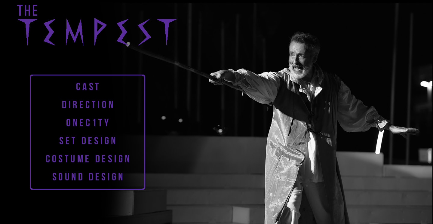 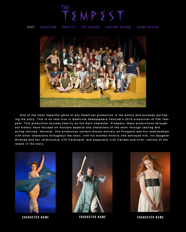 When creating this website, I wanted to make something simplistic, but still polished and reflective of myself. I sketched out a design in my notebook last week and was able to come very close to achieving what I was envisioning through HTML and CSS. I wanted a clean look, which I created through a white background with accents in pink. I wanted there to be a series of three pictures on the homepage as well as an image featured on each internal page. I am proud of myself for being able to eventually figure out how create everything I envisioned for the page. If I knew everything about code, I would have created a more complicated design, but as of now there is nothing I would change about my site. I used the template from the html quiz assignment to create my website. The finished product does not closely resemble the one I worked on for the quiz, but I needed somewhere to start. I made the background and wrapper white to create a clean look. I increased the size of the wrapper by adjusting the width in CSS and added a solid pink boarder all the way around it to add color to the page. I created a jpg in photoshop which included three pictures of me to be featured on the homepage. This allowed me to create the collage in the exact size that was needed. I was able to add all of the elements I wanted to the html fairly easily. Although I eventually figured everything out, I did struggle with formatting on the style sheet. I was able to change the font, size, and color of text, but I could not figure out how to create a larger margin between the photos I added and the text. I looked up tutorials online, but nothing worked. I ended up texting a friend who knows how to code. She told me to increase the right padding on the image in order to shift the text farther to the right. This worked, and I was able to improve the layout of the “about” and “favorites” pages spatially. When designing and creating this website I focused on the linguistic, visual, and spatial modes. For the linguistic mode, I wanted to keep the text simple and personable. I used a list to describe some of my favorite things instead of writing it in paragraph form so that the audience perceives the tone of the website as casual and friendly. I relied heavily on the visual mode in the design process. I wanted to have a visual element on every page to give the audience something to look at and help them have a better depiction of who I am. Each picture signifies something that is important to me. The spatial mode includes the physical arrangement and organization of the page. I have everything evenly spaced out so there is some white space, but not enough to make it look like there is something missing. The audience’s attention is first drawn to the images and title text, followed by any other text, the pink boarder, and the navigation bar. I organized the navigation bar as a natural progression of information people would want to know. Ideally someone would want to see the homepage, learn about me, know what my favorite things are, listen to some of my favorite music, and finally visit my blog. The design strategies I focused on were repetition, alignment, and proximity. I used repetition in the design pattern for each internal page in order to create a cohesive design for the site. Each page uses the same colors, font, style, and border. This helps convey the overall organization of the site. The alignment also ties in to this. I intentionally laid out each element so that they are visually connected to the other elements on the page. If a picture is related to a block of text, they are placed in close proximity to each other. This creates a website that is easy to navigate and comprehend. Hopefully the execution of these design strategies helps convey to the audience that the design of the page was intentional and well thought out.
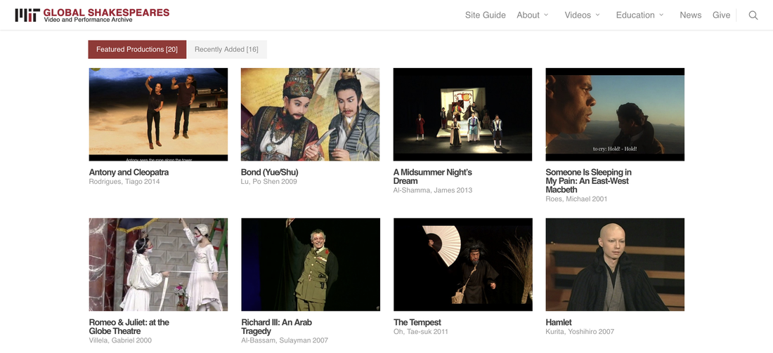 After researching several Shakespeare performance archives, I landed upon Massachusetts Institute of Technology’s Global Shakespeare Archive. It was the best out of the pages I looked at. The overall design is clean and professional, which helps the site’s credibility and attracts more viewers. The archive implements design choices with attention and purpose, which is something that our class needs to be aware of when we create our own Shakespeare archive.
I would categorize the genre of this website as both a performance archive and a university webpage. It was created to house videos of Shakespeare performances from all over the globe. The intended audiences for the site are students, faculty, and researchers associated with MIT. This is shown through the archive’s overall design to serve an educational purpose. There are many resources listed for students under the “education” tab in the menu bar on the home page, such as essays, interviews, and a glossary. Other purposes of the site are for research and to help collect donations for the program (viewers of the site are led to donate through the “give” button in the top right corner). The archive is run by MIT’s literature department and was most likely written by a mix of professors and students in the department as well as other employees of the university. The context of the website is both global and historical. The archive does a good job of incorporating both aspects through the vast number of performances shown. They range in date, location, and style and therefore show viewers many different ways Shakespeare can be performed. There are many things this archive does well in its design and structure. Twenty videos of performances are highlighted on the home page. There are two tabs, featured and recent, to give viewers more ways to browse through the videos. There is a menu bar at the top which consists of six tabs, including “about,” “videos,” and “news.” This makes it easy to find what one is looking for on the site. The “videos” tab drops down to reveal several more options of ways the archived videos are categorized. It is organized well and easy to navigate. There are thumbnails for each video displayed, as well as the director and year of the performance. All of these elements work together to create a successful website that is easy to navigate. Although the archive is designed well overall, there are a few things that do not work well. The biggest area in need of improvement is the “education” tab. The way the essay section is organized creates a look that is jumbled and overwhelming. It is not easy to navigate, and the posts are too close together. The most recent essay is from almost a year ago, so they also need to work on keeping it more up to date. The same applies for the interviews tab. The most recent interview is from 2015. The glossary is formatted in a way in which most of the page is blank, which is not an effective use of the space. If these few areas were worked on, the site would look more cohesive and become even more efficient. MIT’s Global Shakespeare Archive is a good example of an effective performance archive. Some elements utilized on the site could be useful in creating our own archive. Their design and layout are aesthetically pleasing. The way their videos are presented is well thought out and could be implemented in a similar way on our site. The tabs at the top are also helpful to viewers trying to navigate the site. We could employ tabs in a similar way to help achieve the same goal of an organized archive. MIT’s page is a good one to look at before figuring out how we are going to design our own website. |
AuthorWrite something about yourself. No need to be fancy, just an overview. Archives
November 2019
Categories |
||
 RSS Feed
